The UK government e-petitions website has gone live and it has a few oddities and shortfalls (even allowing for it intended to be a simple site). Have a quick look at the response to this rejected petition:
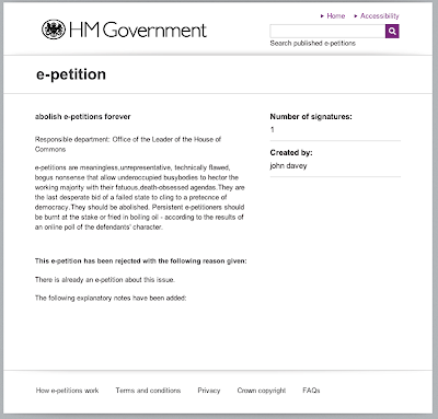


The feedback for rejection simply states "There is already an e-petition about this issue".
Shortfall #1: there is no link to the existing petition to allow interested parties to quickly view it and to respond.
Shortfall #2: the lack of a link is a failure to supply proof. The lack of a link means that the user has the burden of establishing that the rejection reason is true, and because it may not be clear which petition was considered a duplicate this may be difficult. Further, it may be that rather than being duplicated, the new petition was misunderstood and is deserving of being accepted if it was reworded, but the lack of a 'proof link' makes this a much more difficult task.
Shortfall #3: There is a heading for explanatory notes, with none provided. This would be improved if the heading was removed (arguably better still if explanatory notes were added). As it stands the message here is "we couldn't be bothered [rightly or wrongly] to fill in our form". Worse still, it emphasises that your response is using standardised text and there probably is no personal or involved response. Of course this is to be expected, the site has received many petitions and the staff were probably very busy, and standardisation and consistency are valuable approaches, but there is no need to actively promote the realisation that you have been given a standardised response.
Shortfall #4: At launch the site had an FAQ (ignoring the quibble that they called it FAQs). This is a personal bugbear of mine, and one for which I acknowledge can from time to time be okay, but if your site has an FAQ it's normally an admission of failure. "People don't understand our product/site/manuals/etc, and they keep asking us the same old questions, so here are the answers". An FAQ is completely understandable in the context of a product that has already launched and isn't really going to have the issues ironed out because of the prohibitive cost / upcoming sequel. In a website, at launch no less, an FAQ says either "In our pilot we noticed these problems and... we didn't fix them... but this should help you out", or "Before even launching our site we knew that people wouldn't understand it. We just didn't make the effort to make everything clear. So here are the list of problems and misunderstandings that people will probably face". Probably the worst sort of FAQ is the "You won't like our new policy, but here is us putting a brave spin on it".
Anyway. Right there, at the bottom of the page. An admission of failure "we know our site usability isn't up to scratch".
Shortfall #5: A lack of foresight:
These tabs have an indication of how many items they contain. Generally a good idea. On launch-day these were display "100+", which suggests that the index doesn't go above 100. Nice. Day 1, maxed out. Someone didn't expect, or care, that relatively quickly there would be more than 100 petitions. Not much foresight there. Day 2 there are 580 accepted petitions.
Hopefully (as in 'this would be less bad' as opposed to 'this would be ideal') these are rough orders of magnitude and we'll seen 1,000+, etc. The lack of space, particularly on the Rejected tab, doesn't fill me with confidence though.
Shortfall #6: There does not appear to be a Welsh version of the site, which I believe to be a violation of the Welsh Language Act. Naughty.
Despite these complaints I kinda like it. Simple and straight forward, which is what a government website needs to be.
No comments:
Post a Comment